INESCOP
Arquitectura de marca, Comunicación Digital, Diseño, Diseño UX/UI, Estrategia de comunicación, Identidad visual, Sistema de marca
Rebranding of a company in transformation.
Brand strategy
Communication strategy
Visual identity
Brand system
UX/UI design
Creating a flexible and coherent visual system aligned with its brand architecture.
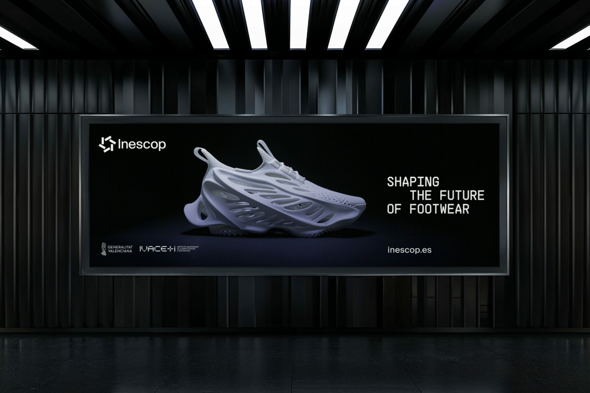
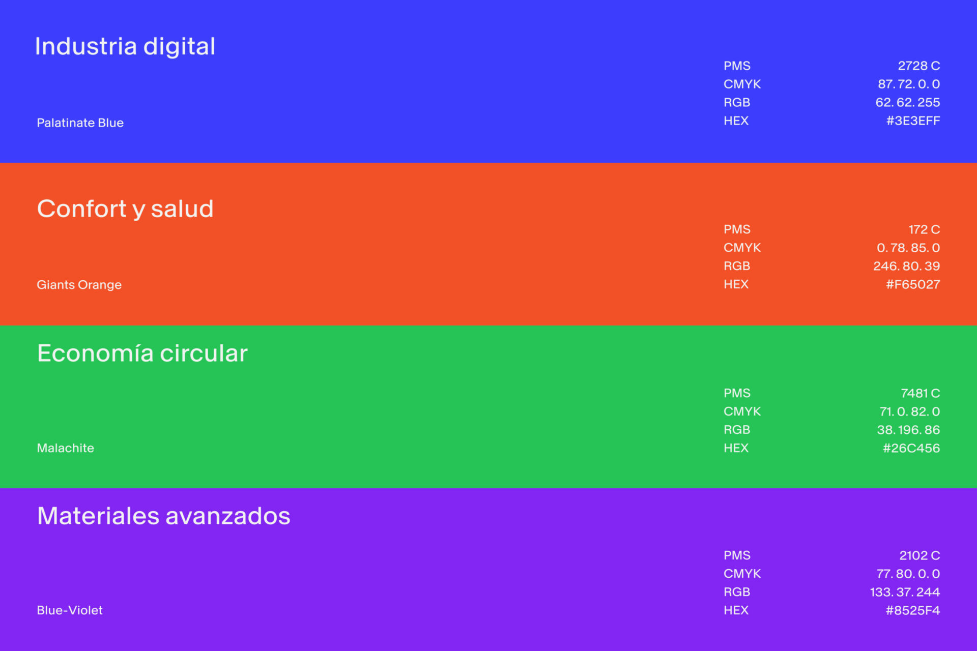
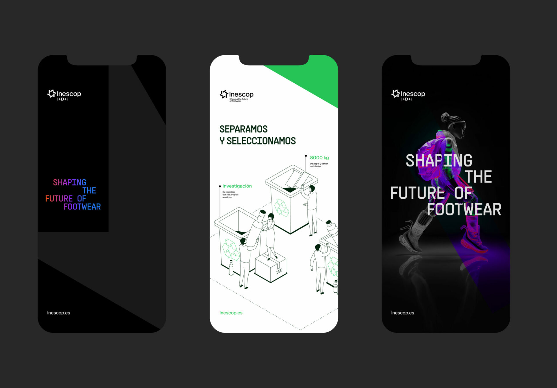
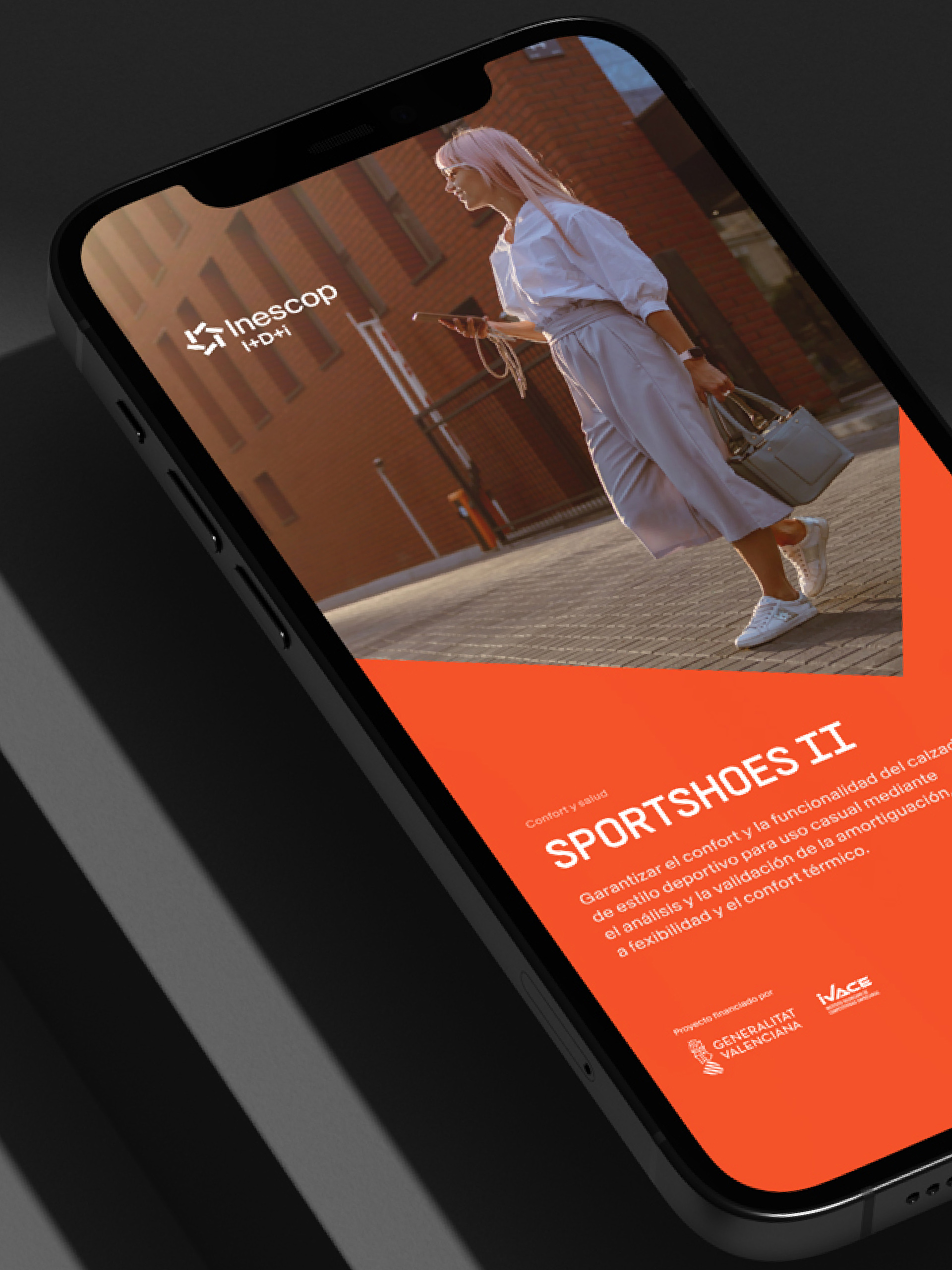
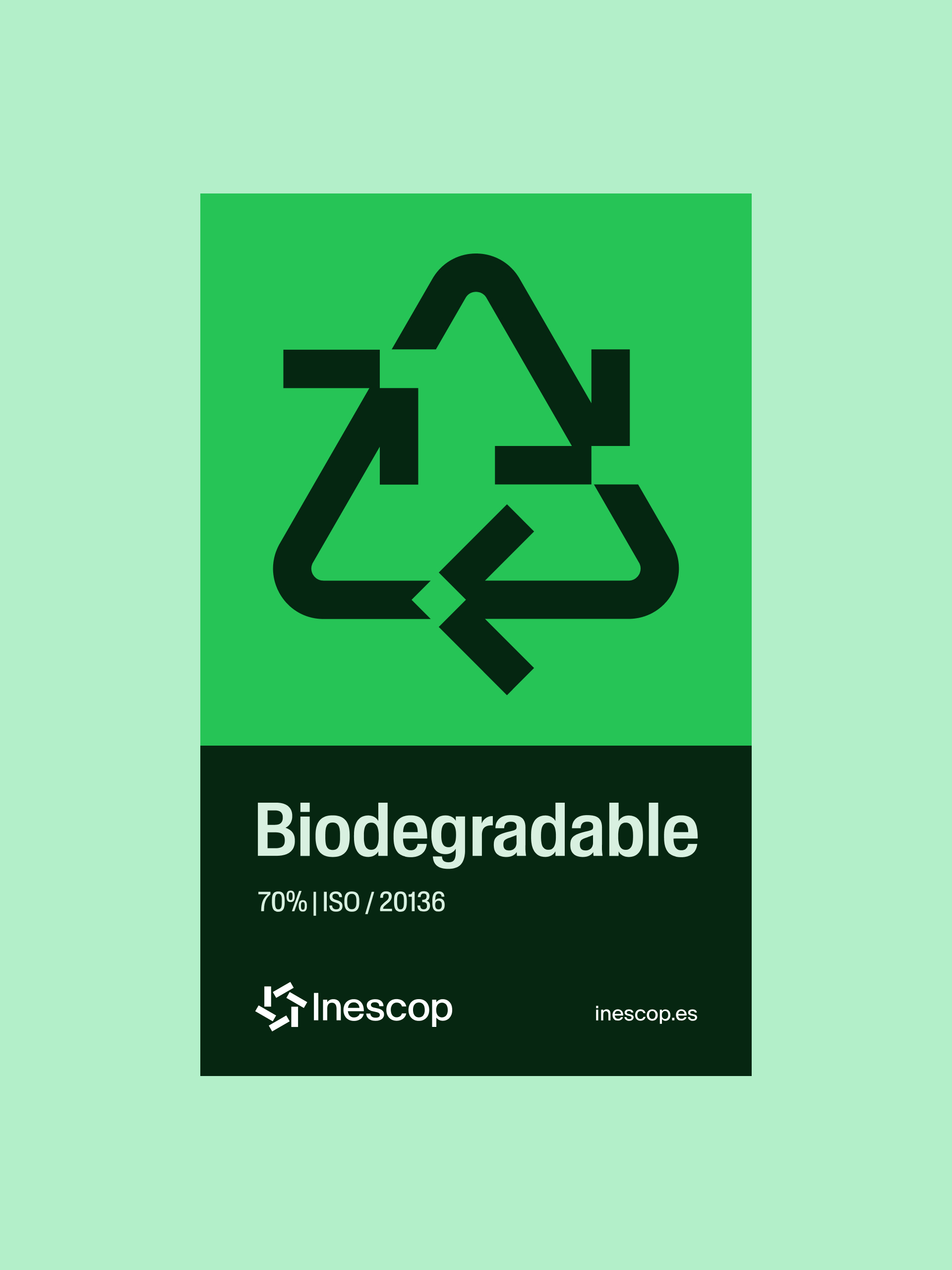
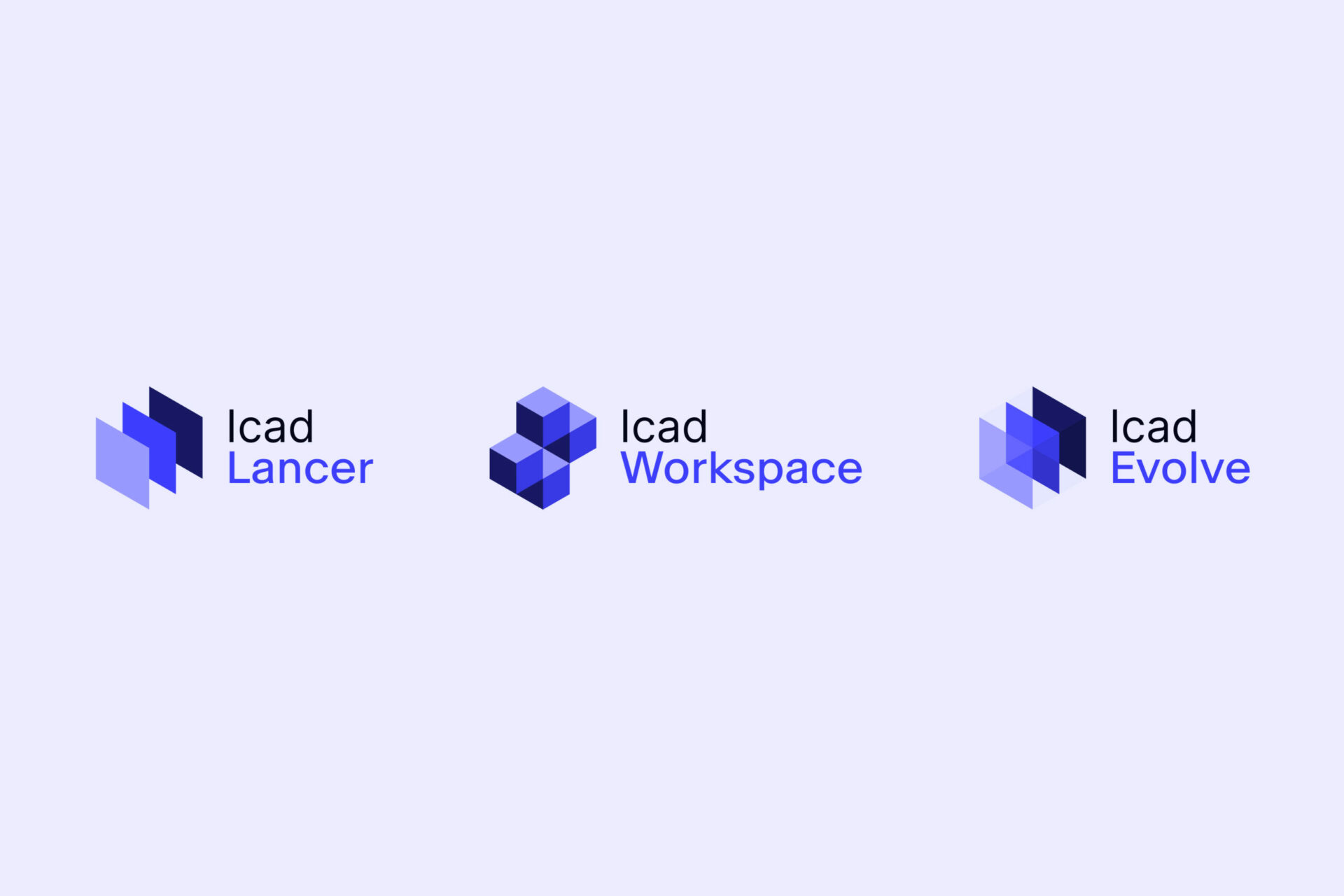
Focusing on adjusting visual codes to reflect its role as a driving force of change in the footwear industry, with a special emphasis on innovation, health, and environmental sustainability. Recognizing the importance of its isotype—a symbol of Valencian design with over 25 years of history and the central axis of our visual strategy—as the foundation to develop the brand, sub-brands, labs, and products. Additionally, we have defined an updated, extensive color palette to identify and differentiate each area of action. Creating a visual system coherent with the brand platform, which includes a timeless typographic expression and a versatile, exclusive iconographic and illustrative style in isometric format (30˚), inspired by the rotation angle of the symbol.
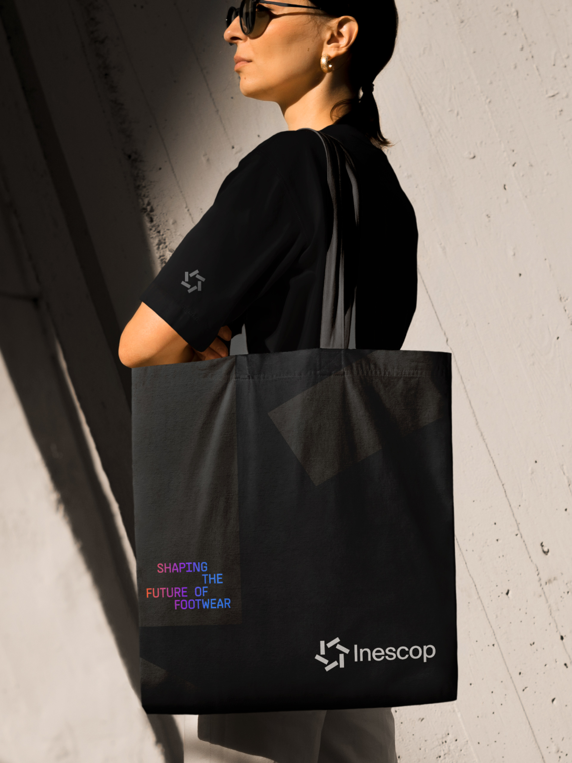
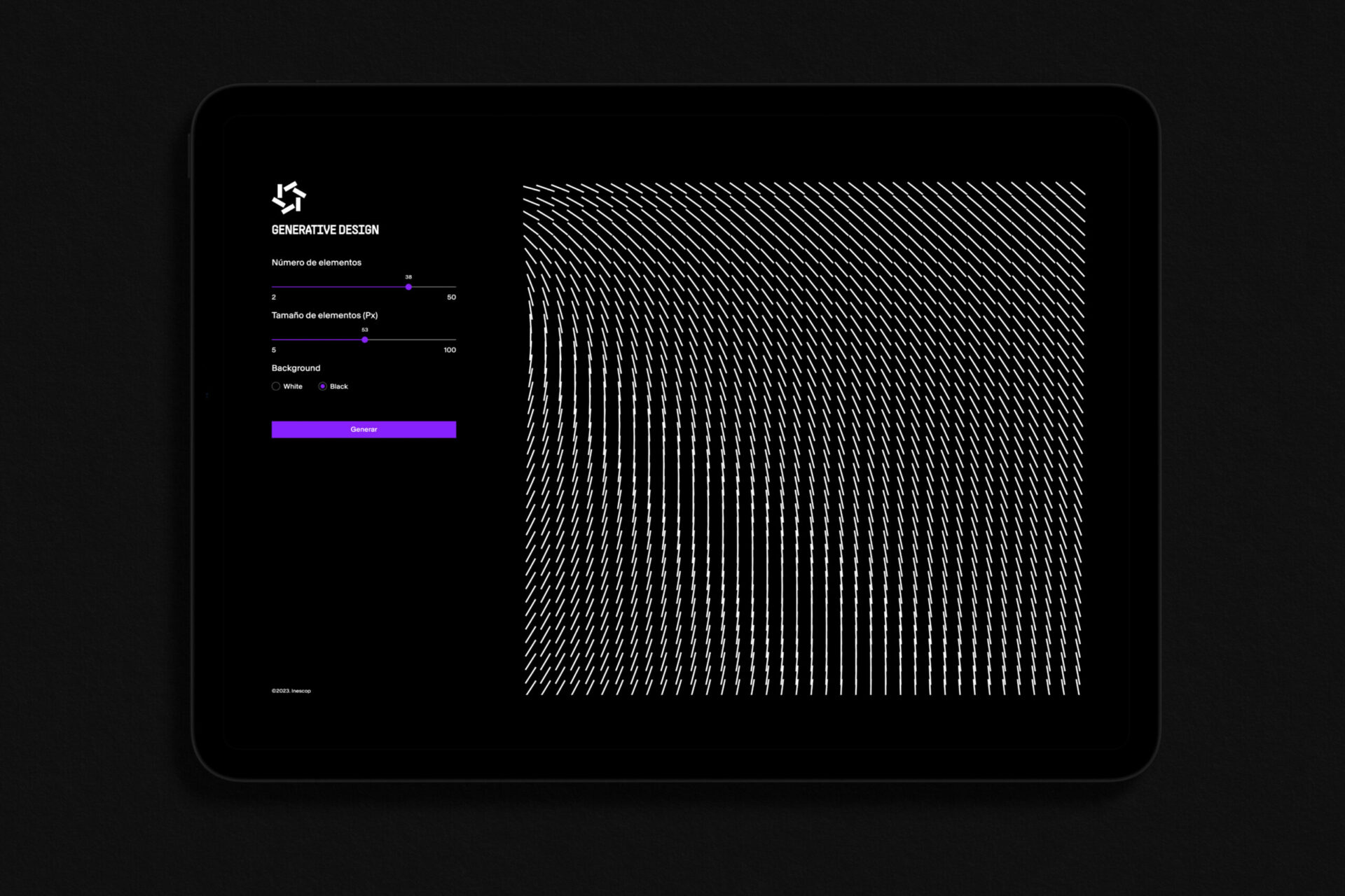
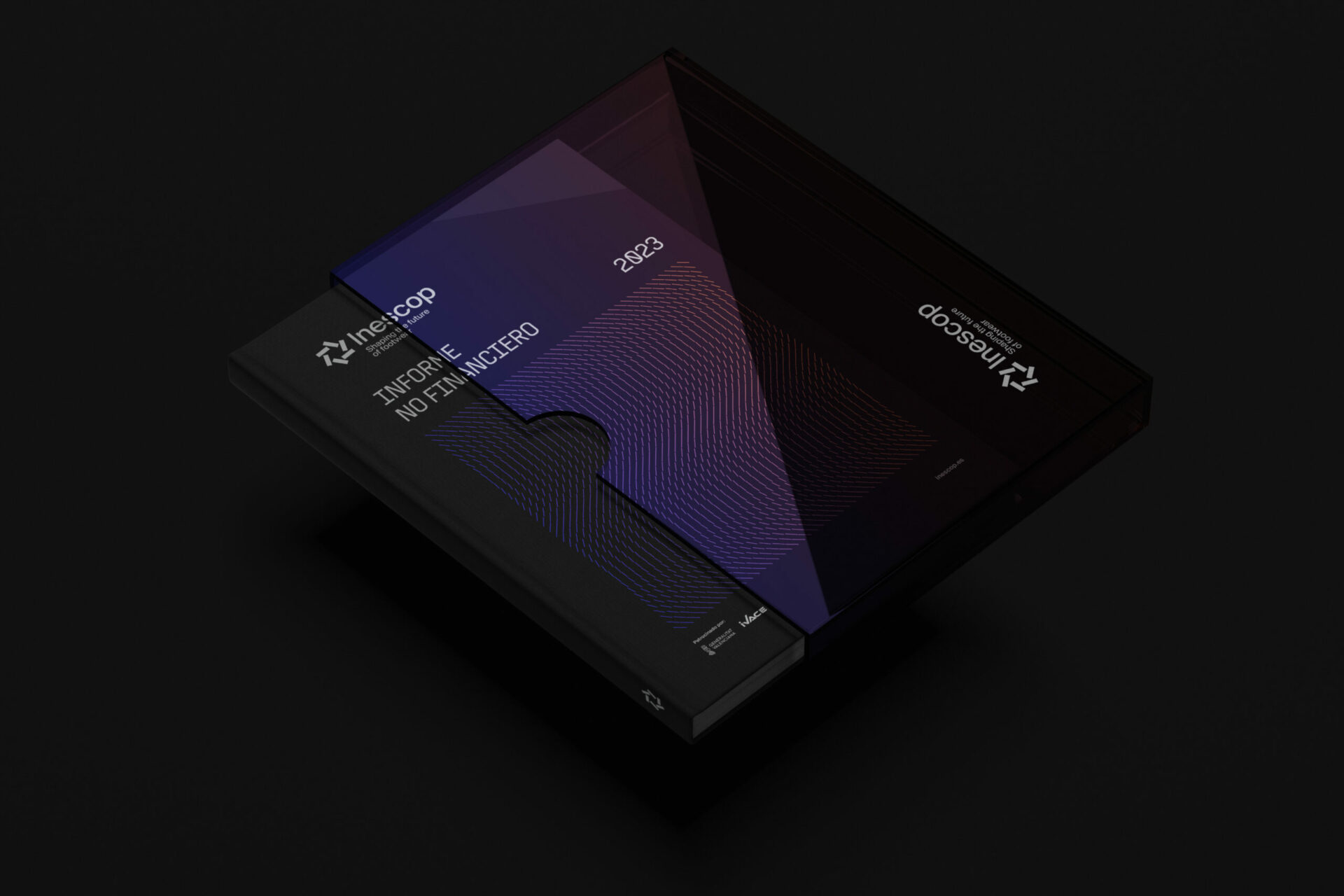
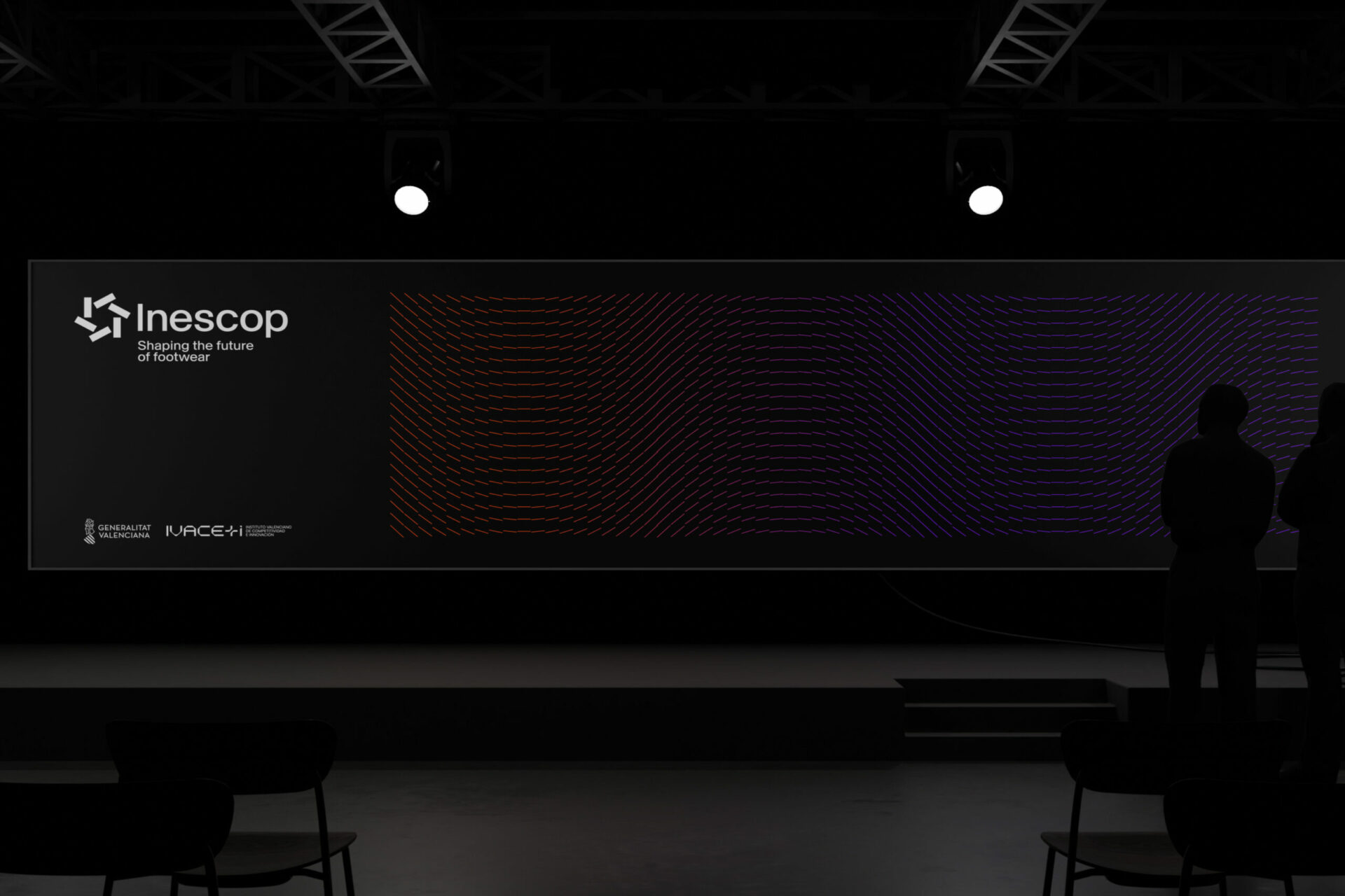
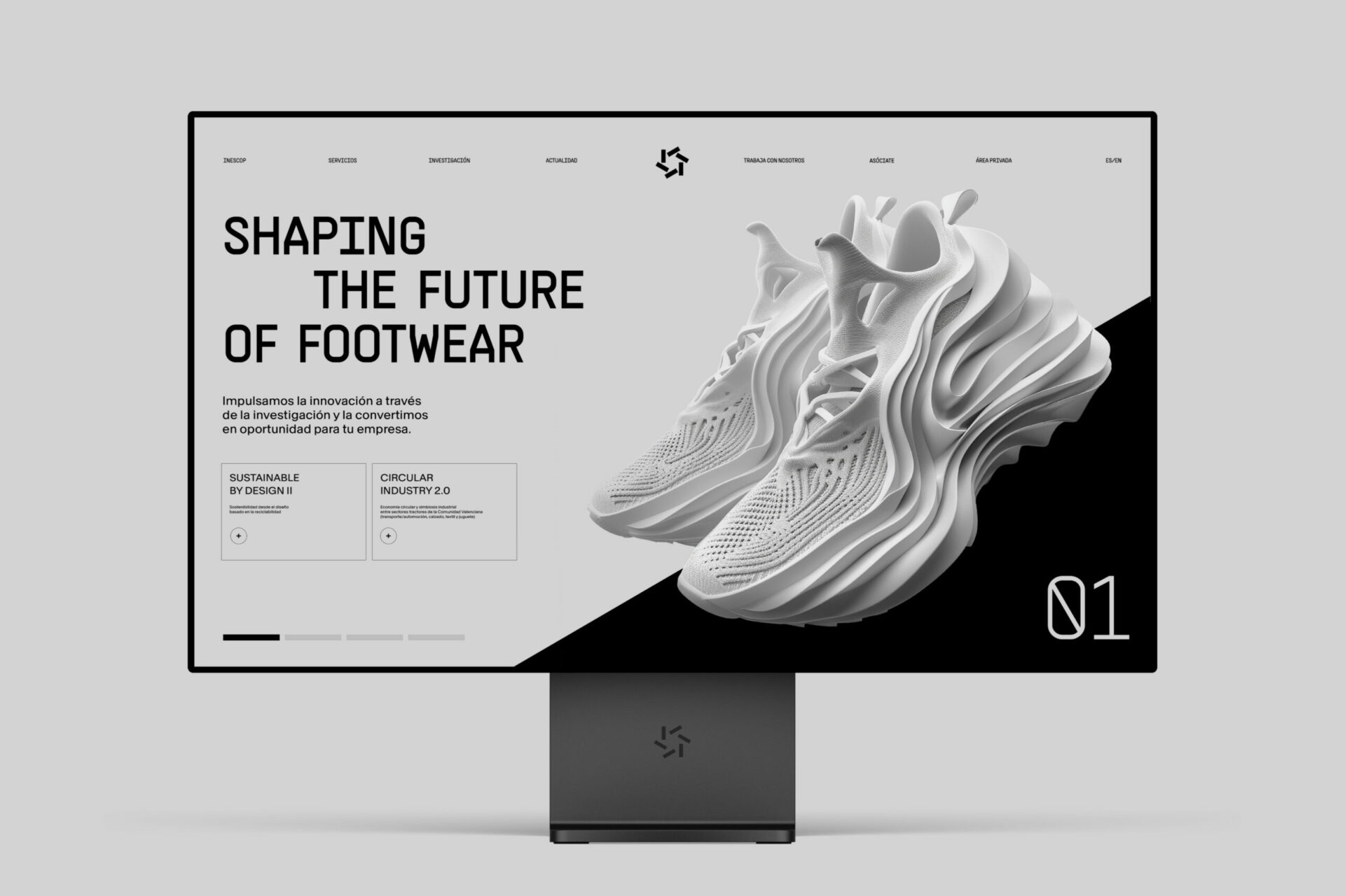
This system is complemented by a timeless grotesque typographic expression. In photography, we prioritize the human element, highlighting its authenticity in each scene and using the symbol as a container to visually compose and support all brand assets. A system that uses the symbol as a container, allowing us to compose with visual coherence and support all brand assets. Such is the importance of the symbol that we have developed a custom generative design software capable of creating patterns generated from it.
